United Airlines
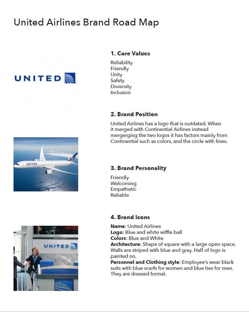
Challenge: United is an airline company headquartered in Chicago, Illinois. Aiming to be a reliable airline who is recognized by their friendly and diverse value for their customers. With the merging of Continental and United Airlines the objection was to create a fresh and modern identity.
Solution: United stands for unity and diversity. The circular shape of the logo represents the unity of both brands and the values that represent who they are. Many of the design choices that were made were to reflect their core values of being friendly, welcoming and diversity. Such as keeping the same color palette but choosing refreshing colors; and keeping their brand voice business casual.
Rebrand | 2018
Brand Identity
Brand Guidelines
Web Design
research —
logo exploration —
old logo —
final logo —
above: exhibition stand following brand guidelines


